Sylvan
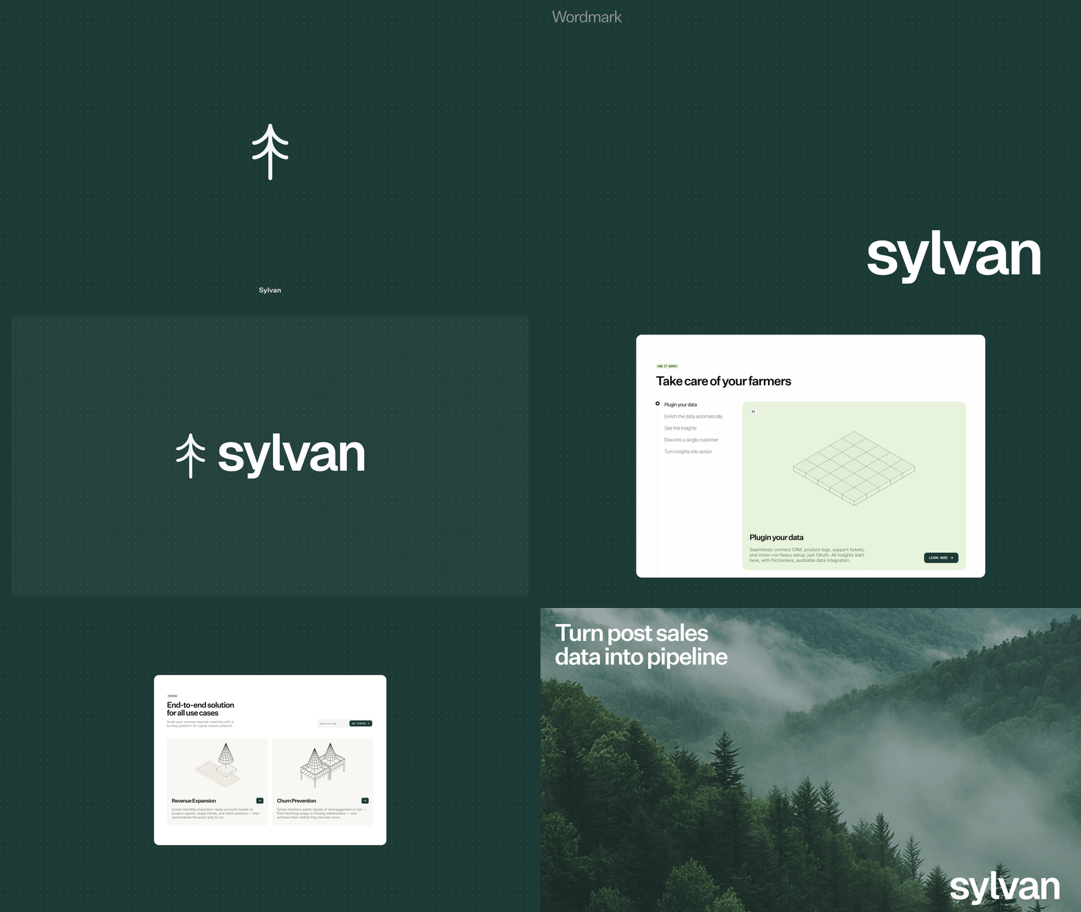
Revenue intelligence that turns messy customer data into useful signals. I did brand, web and visual system.
- Year
- 2025
- Role
- Brand design, logo design, web design, visual system
Sylvan is a revenue intelligence platform with a readability problem: every rival looks like the clutter it promises to remove.
The answer was an identity built around the signal mark: customer actions drawn as patterns over time. It shifts and adapts like real opportunity, and became the core of the brand.
The rule throughout: simple, but never cold. Every piece of the system reinforces one idea: Sylvan turns noise into signal.
What Was Done
Built the identity around the idea of signals and patterns, then carried it across the logo, website, hero visuals and supporting artwork.
How
The product is dense, so the identity had to read clear without feeling like another analytics tool. Simple forms and movement make signals tangible.
The lockup: signal mark and wordmark on Primary.

Favicon variants across the palette.

Untitled Sans, from Klim, alternates included.

The full inventory, uppercase to fractions.

Untitled Sans for display, Inter for UI, Geist Mono for subtitles.

H1 to P3, tracked and leaded.

Black, Neutral Gray, Baby Powder, White.

Primary #1C3B37, with mint and butter accents.

ASCII trees: data and nature in code characters.

Signal trees that grow like the product.

The mark's world, drawn in characters.

Foundations of Growth, Built above the Noise.

The mark, alive on sylvanlabs.com.
Credits: Damilare Osofisan, Mario Prasetyo, HEX
Built with love and music by Damilare.
© 2026 Damilare Osofisan